My quick feedback on iTunes 11 after having played few hours with it.
Innovative expanded view
 Example of expanded view background color selection
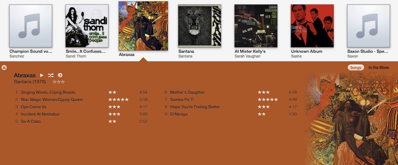
Apple boldly refreshes the immemorial square album cover+tracklist column layout by extracting main color of the cover art and overprinting tracklisting onto it.
I intentionally use the multi-colored Abraxas Santana album cover art to illustrate this feature. Note how, despite the highly contrasted cover art, the result is still appealing : the algorithm pick the dominant color and meld the cover into it by blurring its edges.
The two columns layout and its ad hoc background ambient color provides a retro feel to the whole thing that reminds me of classic vinyl packages. User ratings are incorporated to enhance the barebones tracklisting and integrate nicely in the clean view.
Needless to say, fonts color change dynamically depending on picked background color, to favour readability. When possible, the rendering algorithm will select secondary colors from the cover art to print album and tracks infos, adding to the tuned colors design.
The Up Next takeover
As a big fan of the iTunes DJ/Remote app combo, I was worried when discovering that the built-in iTunes DJ playlist disappeared. No drama though, as it has been integrated in the player controls and rename to Up next songs.
I like that move. Although it was located in the Playlists section on previous versions, iTunes DJ was in fact a special mode built on top of them. Sitted above them, with its unique icon to differentiate it from real playlists.
No more inconsistency. iTunes is now in perpetual DJ mode, and fiddling with next songs is just one click away, great!
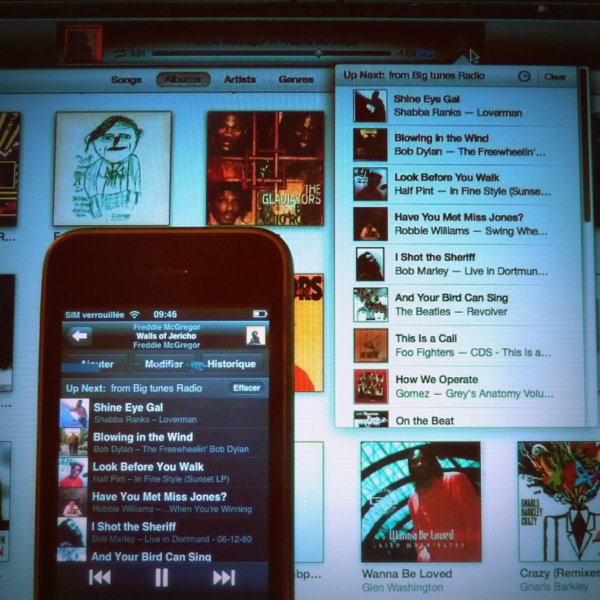 Up next songs controls in iTunes and Remote
Unsurprisingly, upgrading to iTunes 11 breaks iTunes DJ mode on Remote too. So, upgrading to Remote v3.0 is mandatory and comes with its batch of changes :
- Clicking the list button <img src=”/r/assets/images/listbutton.png” vertical-align:”text-bottom”> now brings up the Up Next view.
Each track slot occupy less vertical space than in the defunct iTunes DJ view. Album names are now displayed under track titles and contribute to the rich and compact design. - The album view triggered via same list button on previous versions is no more. Gone with it is the possibility to rate songs.
- The selected view is now a persistent setting. Play a track and switch to Up Next view, go to your library and tap another track : Up Next view is reloaded. That should encourage users making it their default view as it’s more useful than the cover view.
A refreshing update
With iTunes 11, Apple finally reversed the bloated trend that crippled iTunes since years. Unlike past self-acclaimed features (i look at you, Ping), there is no revolutionary change in this release but a global effort to improve the user experience :
- The album expanded view introduces a classy representation mode without sacrifying usability, which is no simple matter (yes, i look at you, Coverflow)
- With iTunes DJ removed, the playlists concept is back to the normal
- Up Next is an elegant way to control tracks selection on Desktop or iOS device
- Editing things just became easier.
Right click an artist name or genre to edit all corresponding tracks. An Edit button has been added for smart playlists. Classic playlists have their Add to button that gives access to a two-panes view to easily drag&drop tracks. - Since the left sidebar is removed, all screen space is dedicated to selected library. Maybe the most important step towards unbloatedness.
These design decisions aiming for simplicity imply doing tuff choices, leaving features aside. The one removal that I regret is the Play higher rated songs more often iTunes DJ setting that worked quite right for me. Let’s hope it comes back soon in one way (via smart playlists?) or another.